
Serene Heng NUS,CNM 22 Dec 88 profile This blog is dedicated to my NM2208 module and it serves as a platform for me to reflect and reminisce upon what I have learnt, created and enjoyed throughout the entire semester. I hope that when the journey finally comes to an end, I would have gained valuable knowledge that will last me for a life time, be it academic based or not. As I read through my archive, I hope to see myself growing yet having fun at the same time. To my friends who viewed this, please enjoy and read it with a light heart. Comments are greatly welcome. Please direct them to HERE. Thanks! archives affiliates my personal blog credits you can remove this if you don't have a conscience. i assure you i will not hunt you down. skin by: Jane |
Tuesday, September 30, 2008 @ 7:30 AM
Assignment 2 Classroom Design Assignment!
For the classroom design, we were told to find an object and create a either iconic/indexic/symbolic. For me, i did the indexic design. As you can see, the picture shows a lady(WHO IS IN FACT, MISS SERENE HENG =p) in a very nice dance pose and below writes "dance studio". This sign will be place on the dance studio door to tell people that the room is a dance room. For this week assignment, we are supposed to create a sign that can be placed anywhere in the NUS community. After much contemplation between the usual vending machine, water cooler and photo-copying area, I decided upon the theme: Electrical Socket. I don't know if it is coincidental, but a lady approached me in the library and asked there are any sockets available inside. =) As we are supposed to create 5 images of the sign with increasing abstraction, I managed to find a somewhat complicated( at least to me) picture of an electrical socket. 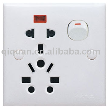 As I move down from drawing the first frame to the next, I removed unnecessary components from the frames. Eg, the inserts that are not available in Singapore. Bear in mind the electrical socket that Im using as reference was selling at overseas countries. To my surprise, my last two frames were only made up of basic shapes like circles and rectangles. Still, the frames were able to portray my socket effectively. I learnt, the power of simplicity and minimalism. For my final prototype. I picked the 4th frame out of the five that I have created because I feel it can be understood easily at first glance. However, my tutorial mates questioned me where am I going to place the sign because without the important arrow to indicate where exactly the socket is, the sign is as good as none.  before
after Firstly, we need to have a sign to indicate where the socket is is precisely because the location of the socket is placed at such low and hidden area, many students are unable to spot where the sockets are. Hence, the sign will be placed directly above the socket at around the eye level of the students so that even from far, you will be able to see the sign and know there's a socket below. If the socket cannot be seen from the north, south or west of the sign, the socket must be in the south. But if there really is a need to an arrow, the arrow will be of another sign by itself placed below my switch sign. Conventionally, red backgound signifies danger, green for emergency exits and yellow for warning. I tried out all possible colours, including blue and pink(my favourite colour) that I think will go well with black and white. However, I decided to go against the convention and use yellow as my background. This is because as my sign is going to stand alone by itself on the wall, I need a colour that can attract attention. Yellow being a striking bright colour is the best out of the rest. And there you go. =) |
 HOHOHO! im so proud of myself. well done serene heng!