Serene Heng NUS,CNM 22 Dec 88 profile This blog is dedicated to my NM2208 module and it serves as a platform for me to reflect and reminisce upon what I have learnt, created and enjoyed throughout the entire semester. I hope that when the journey finally comes to an end, I would have gained valuable knowledge that will last me for a life time, be it academic based or not. As I read through my archive, I hope to see myself growing yet having fun at the same time. To my friends who viewed this, please enjoy and read it with a light heart. Comments are greatly welcome. Please direct them to HERE. Thanks! archives
affiliates my personal blog credits you can remove this if you don't have a conscience. i assure you i will not hunt you down. skin by: Jane |
Saturday, November 8, 2008 @ 8:39 PM
StoryBook P.S. I created new classroom designs for assignment 2 and 3 and also a new new poster for assignment 4! Do check them out cause im very very proud of myself! hahaha. Why Polar Bears Are White View SlideShare presentation or Upload your own.
We were given approximately two week to come out with the whole time and another week to send it to the printer. The entire process was, I must say, very challenging and exhausting. As the 4 of us have different schedule, we are not able to meet physically but only through new media like MSN. We did most of our discussions and sending of files there. The target audience of the storybook is for children 6 year old and above. No doubt, our story is original, has morale behind it and has beautiful and colourful illustrations to capture children attention. There are ample breathing space between the text and the pictures. We used fun and round font that is easy to read. Friday, October 31, 2008 @ 7:56 AM
miscellaneous    These are some of the posters and storyboard i created and drew for my nm3215 advertising strategies project. Shouldn't really appear in this blog but I guess it kinda overlaps with this module. Spot examples of Gestalt's Principle of Continuity and Closure. =) These are some of the posters and storyboard i created and drew for my nm3215 advertising strategies project. Shouldn't really appear in this blog but I guess it kinda overlaps with this module. Spot examples of Gestalt's Principle of Continuity and Closure. =)The storyboard is about how a family of three goes about carrying out daily activities while Kiehl's( the brand we chosen for our project campaign) products come in handy and meet their needs. I really like the cartoon! haha. Monday, October 20, 2008 @ 10:59 PM
Assignment 6 - Presentation P.S Thank you to the 11 kind-hearted souls who did the poll for me=) The result's out: Blue, White (55%) Pink, White (9%) Grey, Light Blue (18%) Brown, Grey (18%) Total Points Mapped: 11 Guess i'll stick to my original piece then. =) Thanks guys! * For this pair work assignment, I completed it together with Ellen and presented our work to the class during tutorial. We were told to find 1 good and 1 bad poster, analyse them and build a case to support our opinion. The analysis should be based on visual principles including visual form, visual harmony, colour and gestalt principles. We split up the workload where each of us will find a good poster and coincidentally, the posters we found were of on the same theme: Horror/Thriller. In order to be consistent and in sync with the theme, I designed the PowerPoint slides in such a way that it creates the horror atmosphere. It is indeed difficult to find a relatively bad poster nowadays because of the high quality checks. More often than not, posters we have seen are used paid assignments and hence there is a certain level of standard the designer needs to meet. Gestalt's principles are great. So are the other existing rules in this world. However, sometimes, I can't help but feel that we are tied down by these theories and formulae to do our tasks. If we don't meet them, our work might be consider as below average or even worse than that. It's good to learn and use these principles as a guide. But, I guess we really shouldn't dwell on too much or be too particular whether they are being followed all the time. Life should be more interesting than just revolving rules and regulations. Wednesday, October 15, 2008 @ 12:13 AM
Assignment 6 - Classroom exercise Gestalt's Principles were taught today in lecture. I have so much fun participating the visual game. We were asked to remember as many details as possible for 2 minutes and then Dr Julian gave us a series of questions to test our memory. I got 6 out of 10 correct. haha. Surely I can do better than this. We were then instructed to create 3 images to demostrate any of Gestalt's Principles such as proximity, similarity, closure etc. This was what I did using Illustrator. =)  I'll be doing my assignment 6 with Ellen! =) Monday, October 13, 2008 @ 6:27 PM
assignment 5  before before
 after after
Some minor edition made. bald trees were made more obvious and also the alignment.=) *CLICK TO ENLARGE*
This is my lastest workpiece and I'm totally in love with it. *GRINS* The objectives of this assignment is create a greeting card themed either Christmas or New Year and illustrate the mood/theme primarily through colors(85%). Also, we need to include a quote related to our card. During the lecture, there were so many terms and concepts being taught and I got lost. Hahaha. Luckily we were able to download the lecture slides for guidance. *SIDE TRACK* Most of the time, Im using Illustrator to do my assignment and as you know, Blogger doesn't allow us to upload PDF files. By pure luck, I discovered a way to change my pdf file to jpeg. PHOTOSHOP. Yes, open the file in Photoshop and save it as JPEG. *END OF SIDE TRACK* First of all, the mood I was tryin to create is the kind of cold, lonely christmas you have to go through when your love ones are faraway from you. It's very different from the typical merry Christmas occasions where everyone is happy. Because I know of friends who dread Christmas. This card is made especially for those who are overseas, whose heart still linger in their homeland. This explains why I choose the quote, " Christmas is lonely without you..." I had the most of the drawing sketched out first, scan it into my laptop and filled it in with colors, with exception to the heart logo. After live paint, a function by illustrator, I have all my design in one colour only. Hence, to create colour for different parts of the card, I added a lot of layers. A lot. I guess because Im quite a noob at using Illustrator, which explains the duration( one whole day literally) and the number of times I restart my laptop because Illustrator crashed. Hahaha.
After a million attempts, I finally gotten my A3 colour scheme properly done. The colours were so fresh and bright I felt really happy and proud of myself. I love all the colour combination created. haha. I guess this is still the most decent work produced out of all 5 assignments. The black border around are intentional because I feel the the black is able to bring out the Colour better as compared to having a white or no borders at all. Looking at the colour scheme, my first workpiece is actually the bottom left dark grey piece. It gave me a mood, sad night. Just like how it would be when you are alone, watching the sunset till the sky turns dark. Other colours are great too. like the top right light grey. the one just below it reminds me of autumn. Hahaha. I guess the baby pink colour suits as well. sweet, romantic and love. OH MAN I DON'T KNOW! Colours really can bring out a totally opposite feel to the pictures. Same design but different feel. I already have autumn, desert, happy, modern feel on top! haha. I need you help, guys. Help me do a poll and tell me which one is your favourite! =)
If you think other choices are better, let me know too! thanks! =)
Wednesday, October 8, 2008 @ 7:53 AM
Assignment 4 P.S. I couldn't stand my ugly poster. So i did another one. haha!  Bicycle. I created the typograhpy using only one word throughout: Life. Life is like a riding a bicycle. You start from the first stage where you know nothing about journey through one, to the second stage(peak) where you could ride smoothly or even speed through. However, it will also come to a point, the third stage, where the bicycle runs down and is unable to move forward anymore. My design is about the third stage, a phase where it is impossible for you to move on. Many a times when one faces too many problems one shot, his/her life seems to be stucked at one place and is impossible for her to move on. And because of that, there is a high chance that one may fall into depression. Hence, my poster intends to encourage these people, to reach out for help. =) * Well well, for this week, we were given two exercise. Firstly, to sketch two simple pictures in class using simple lines and dots. Each pair are given two unique words as a theme. For me, I was told to draw on ''Mighty'' and ''Value''. Secondly, to create a poster with regards to our environment in A3 size. Here's mine two little sketches: ( Can you guess what they are? Answer will be given at the end of this entry.)
For my second assignment, I want to design a poster for children age around 10+ and that it has something to do with saving the plants. I came out with a few headings such as "Stop deforestation", "Let them live"and " Stop poaching" but I decided upon the third one because I thought the heading was short and sweet. Here's the draft to my poster:  I choose Mario as my character because I feel everybody and every child know him. Hence, Mario is like a bridge for me to convey my message to the recipients. Also, I pixelate the picture to make it as though the picture was taken from the computer game where you can still see all the small pixels. While I attempt to control's the viewer's attention, my poster was changed from landscape to protrait because viewer's eye movement will channelled from top to the bottom in an orderly manner. During tutorial, my friends gave me some pointers on my poster:
I do agree with what my friends have mentioned. In regards to the points above, I changed the heading to ''Stop Plucking Plants" and reduce the number of words under additional information. Apart from that, I personally feel that my poster has not fulfilled the visual balance a proper should has. I feel that my poster is loaded with too many information, uncessary graphics and emphasized on unimportant words. The overal poster isn't pleasing to my eyes. I'm really not satisfied with it. So, I edited the poster again.  During today's lecture, I learnt about colors. I've gotten rid of those unnecessary colors and tried to keep the number of colors to minimal. I like the updated version much more than the original one. Maybe because the flower is Pink. haha=) Check out this space again and probably I'll upload it soon. Answer: Friday, October 3, 2008 @ 10:38 PM
Assignment 3 Classroom Design Exercise!  As you know, my sketching skills can really match those of primary school kids. maybe they are even better than me! So, i did my design using illustrator again. haha. For this week design, we need to capture a ''freezing time'' scene and tell a story about it. From my picture, you see a girl who is trying to act like a boy( insert ciara's song : Like a Boy") holding a gun on both hands. I know its a girl because she is actually me. YES. This scene is about a sucidal scene where she has already lost all control over the situation. She couldn't face the truth/consequences and so deicided to kill herself to end it all. Her left hand gun is pointing towards another person who is trying to approach her. * Models: Daddy Heng, Mummy Heng, Xiao Qiang Venue: Our cosy house Photograhper: Miss Heng         Hope you enjoyed my story. =) You know, the setting at a house as background can be quite distracting. With so many colourful furniture and messy tools around, these things are going to compete fiercely for attention with my models. And that's the last thing I want to achieve. I don't want audience to lose their concentrations on my models. It's easy to tell the location is at home because my male model isn't wearing any shoes, even though you cannot get clues from the background. I shoot the scenes against a white wall so as to leave out so much distraction as possible. However, I wasn't satisfied with a white background. I tuned up the highlights, changed the pictures to black and white to create a consistency between my pictures. Most importantly, to leave out any potential eye-catching colours that will steal attention away. In lecture, we learnt the differences between shooting horizontal and vertical lines. To create a peaceful, gentle feel, shoot horizontally. For a picture full of strength and action, go for vertical/diagonal angels. Hence, for picture no.7, to create the ''action picture'', I shot Daddy's hand in a diagonal angel to protray a forceful feel. Nonetheless, I feel that this picture can be further create the motion feel if I could blur the background like those we seen in a comic strip. But, as my background is already white, the effect could not be seen clearly. For other pictures, I try as much as possible to shoot my pictures following the rules of third. But, I can conclude it is really quite difficult. You need to position the model in the correct pose while taking into account conditions such as the lightings and the shadow casted(if any). Overall, I pretty much like the story=) Im very sure there are rooms for improvement. Like the composition (especially for picture no.1 !) and the consistency in lightings for each picture. and like what other photographers always tell me," shoot more and you will learn more." =) Tuesday, September 30, 2008 @ 7:30 AM
Assignment 2 Classroom Design Assignment!
For the classroom design, we were told to find an object and create a either iconic/indexic/symbolic. For me, i did the indexic design. As you can see, the picture shows a lady(WHO IS IN FACT, MISS SERENE HENG =p) in a very nice dance pose and below writes "dance studio". This sign will be place on the dance studio door to tell people that the room is a dance room. For this week assignment, we are supposed to create a sign that can be placed anywhere in the NUS community. After much contemplation between the usual vending machine, water cooler and photo-copying area, I decided upon the theme: Electrical Socket. I don't know if it is coincidental, but a lady approached me in the library and asked there are any sockets available inside. =) As we are supposed to create 5 images of the sign with increasing abstraction, I managed to find a somewhat complicated( at least to me) picture of an electrical socket. 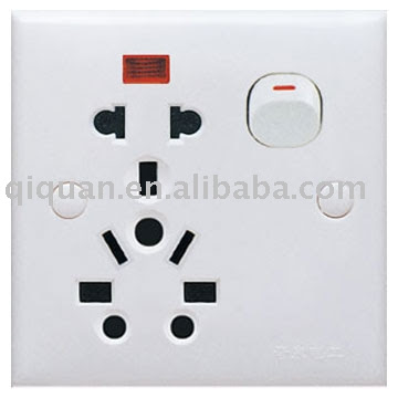 As I move down from drawing the first frame to the next, I removed unnecessary components from the frames. Eg, the inserts that are not available in Singapore. Bear in mind the electrical socket that Im using as reference was selling at overseas countries. To my surprise, my last two frames were only made up of basic shapes like circles and rectangles. Still, the frames were able to portray my socket effectively. I learnt, the power of simplicity and minimalism. For my final prototype. I picked the 4th frame out of the five that I have created because I feel it can be understood easily at first glance. However, my tutorial mates questioned me where am I going to place the sign because without the important arrow to indicate where exactly the socket is, the sign is as good as none.  before
after Firstly, we need to have a sign to indicate where the socket is is precisely because the location of the socket is placed at such low and hidden area, many students are unable to spot where the sockets are. Hence, the sign will be placed directly above the socket at around the eye level of the students so that even from far, you will be able to see the sign and know there's a socket below. If the socket cannot be seen from the north, south or west of the sign, the socket must be in the south. But if there really is a need to an arrow, the arrow will be of another sign by itself placed below my switch sign. Conventionally, red backgound signifies danger, green for emergency exits and yellow for warning. I tried out all possible colours, including blue and pink(my favourite colour) that I think will go well with black and white. However, I decided to go against the convention and use yellow as my background. This is because as my sign is going to stand alone by itself on the wall, I need a colour that can attract attention. Yellow being a striking bright colour is the best out of the rest. And there you go. =) Sunday, September 7, 2008 @ 12:41 PM
Final - Assignment 1 After much contemplation, I've finally picked out two of my favourite copies as my final prototype. =) However, blogger doesn't allow me to upload PDF file to show you here. Hence, I'll be printing out the hard copy, take a picture of it and post it on my blog soon. Be sure to check back again for the pictures! Previously, my draft for 'Happiness' was unacceptable. My classmates commented that my picture brought out a more gloomy atmosphere than a happy one. Colours reflect upon the overall mood of the picture. Indeed, rain as it is, often gives audience a sense of loneliness, lost and despair. Hence, to counter that, in my prototype, I added rainbow as an umbrella into the picture. Since the focus of the picture is having fun in the rain, I placed the rainbow umbrella in such a way that it did shelter the people at all. You have an umbrella but you don't want to use it. Why? Because you want to play in the rain.=) Also, I added a background gradient to create the cooling feeling you get during rainy days.  Violence can exist in many forms. To me, vulgarities seem to be the root of violence. It sparks off heated argument and leads straight off to physical abuse. In the digitized world, vulgarities are sometimes sensored off and symbols are used to represent profanities. Notice that the start of my name begins from the mouth of the character on the left and ends at the ear of the character on the right.  In class, I learnt that shapes that are angular give a stronger, more forceful feeling compared to round or curvy shapes. So, I re-edited the shape of my name to make the ends more edgy and sharp. Indeed, the ends do make a BIG difference. * After edition! eeeyeer! the colour on my screen is not like that! i guess much of the colours are lost when i re-save it so many times. Happiness, you can see my name more clearly now can't you? the rain is made up of rainbow colours to depict the joy of playin in the rain.
For verbal violence, i removed the distracting background and kept everything simple. Words are made more edgy and sharp.
=) Sunday, August 24, 2008 @ 12:04 PM
Assignment 1 my resource bank is as big as an ant hole. despite the fact that i dream every night, none was vivid enough for me to record down. but before i could begin constructing my ideas, I was told during lecture that I need two words, one that represents something I love and the other which I hate. I sat down thinking hard. I want to jump away from the norm. I tried " I love mushrooms" but was stucked badly by the difficulty in drawing them. So I went online and started looking for pictures of mushrooms as a guideline. Still, even though I have so many pictures of mushrooms, it did not help. I managed to come up with one average looking design. *inserts 'wrong answer' sound* i tried Olympics too. *inserts 'wrong answer' sound* I need other words. I know I need to open my eyes and observe. One day, while I was still vexing of what to draw, it started to rain. Umbrellas were opened up as the heavy clouds gathered in a gang. Friends who got drenched together seemed to be happier than those with umbrellas. Instantly, it reminds me of the days when I used to play in the rain and the fond memories put a smile to my face as i reminisce. Like how the female lead in TV dramas love to say," Rain can washes off all my pain." So, I've got it. Happiness. My name is Ser and I love happiness. *** Below are 4 scenarios where I'm happy. 1) cliche as it may sounds, rain washes away my tears. Or at least, camouflage them.  thumbnail 1 2) what is happiness without your family, relative and friends by your side? my shelter hasn't changed for the past 20 years. i grew up in a neighbourhood where my most of my primary and secondary school classmates stay near me. naturally, we created so much fond memories together in this community. the place where i live, is the place where happiness began.
thumbnail 2 3) Olympics- a highly discussed subject among my peers for the past weeks. while i was on my way to school, I caught the live telecast of gymnastics on SBS. When China won the gold medal, i though that I was at the stadium witnessing the whole event. I could almost feel China's players euphoria as they punch the air in victory. So much hard work and time had been put in. They truly deserve the gold. I was so moved and happy for them, I teared on the bus.
thumbnail 3 4) When life becomes so pack, all it takes is just one day of peaceful rest to rejuvenate my body. A lazy afternoon that allows me not to do anything but rest. =)
thumbnail 4 *** HATE - is a strong word that I hate. I hate it when things go wrong and people resort to violence. I hate it when people get injured, whether its physical or emotional because of that. I hate it when a simple problem became complex when irreversible moves are taken. I hate violence. 1) words can be so beautiful it became a poem. at the same time, words can hurt us. sprouting vulgarities may seem alright but it is actully an hidden/invisible weapon which can cause damage that is greater than the sharpest knife.
thumbnail 1 2) War is the time when violence scenes are the most prevalent. A sea of dead bodies. Somehow, the dead bodies look at ants to me. ><
thumbnail 2 3) When bombs are dropped, it set buildings and houses on fire. Fumes billowing out of the window create a cloud in the sky.
thumbnail 3 4) A knife can be helpful to us yet it can also be so deadly. It is only when harm is caused and blood starts to drip down do we know that knife has become a weapon for violence.  thumbnail 4 *** During the tutorial sessions, I've learnt something new. Inspirations don't come as and when you like. For me, it was so difficult to start drawing something. However, the most difficult part isn't drawing the first line. Instead, not knowing when to stop drawing/editing is actually more problematic. Food for thought. |
 Then, I went on to play with the colours( this is the part where it crashed the most number of times) From Complementary colours to Analogous to Tetrad to playing with the hue and tone and temperature, I created so many different feel that I didn't know colours are able to do. Initially, my picture was black and white and I already though it was good enough until the colours came in.


 HOHOHO! im so proud of myself. well done serene heng!


